


Thank you for your message. It has been sent.
Software & analysis tools
Eco-Visio
Learn More

Software & analysis tools
Data validation & reconstruction
Learn More
Software & analysis tools
Data sharing tools
Learn More
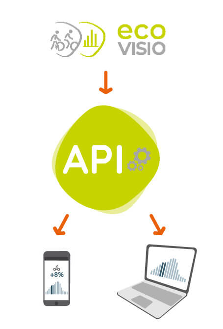
Software & analysis tools
Eco-Visio API Evo
Learn More
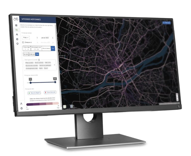
Software & analysis tools
Cycling Insights
Learn More
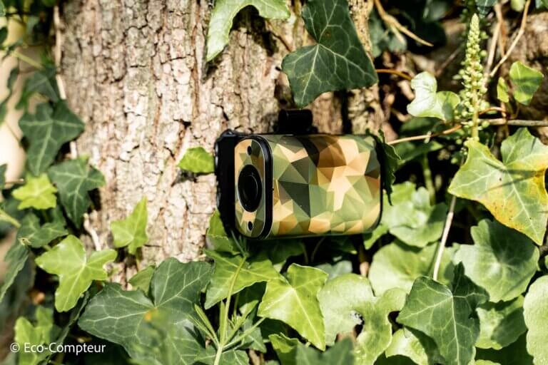
PYRO Evo Range
Nature Post Evo
Learn More

PYRO Evo Range
PYRO-Box Evo
Learn More

PYRO Evo Range
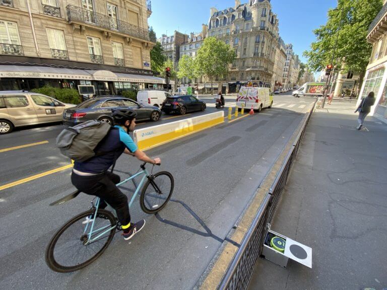
Urban Post Evo
Learn More
PYRO Evo Range
PYRO Nano
Learn More

ZELT Range
ZELT Evo
Learn More
ZELT Range
Easy ZELT
Learn More

MULTI Range
Urban MULTI Evo
Learn More

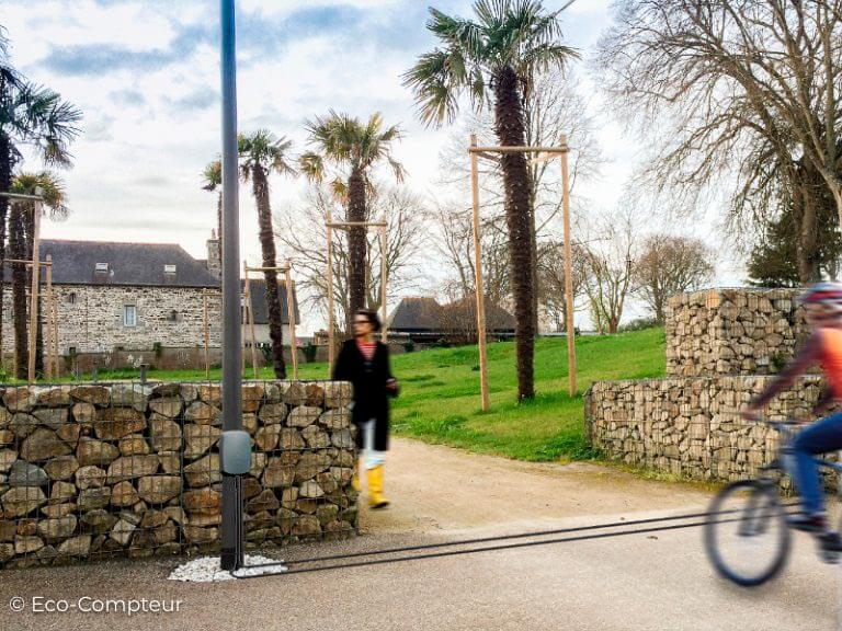
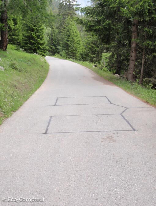
MULTI Range
Nature MULTI Evo
Learn More
MULTI Range
Mobile MULTI
Learn More
MULTI Range
MULTI Cars / Buses
Learn More

MULTI Range
Urban MULTI
Learn More

MULTI Range
MULTI Nature
Learn More
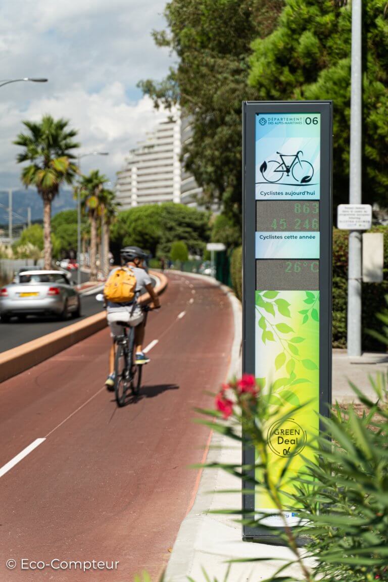
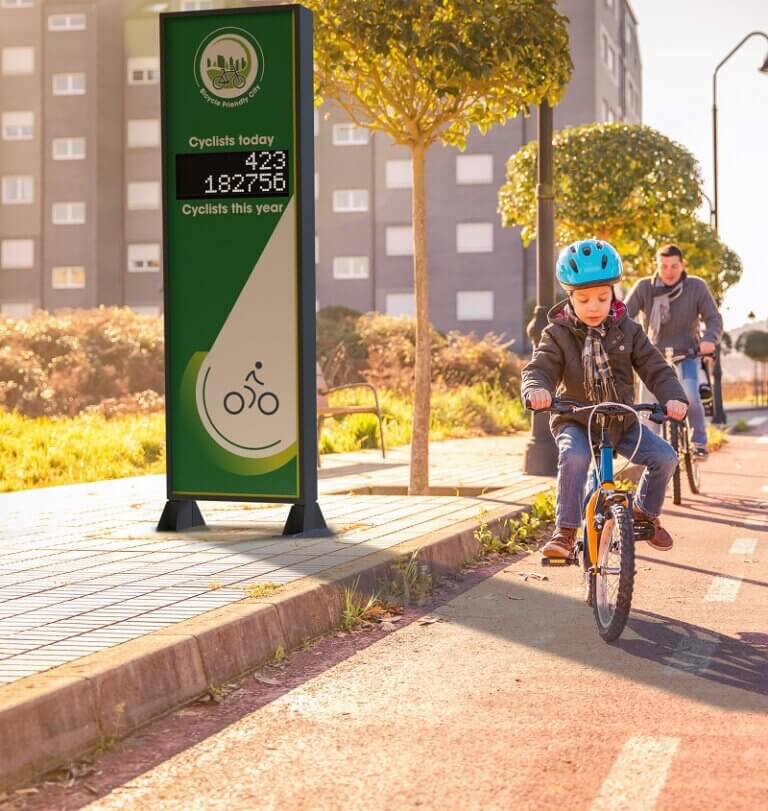
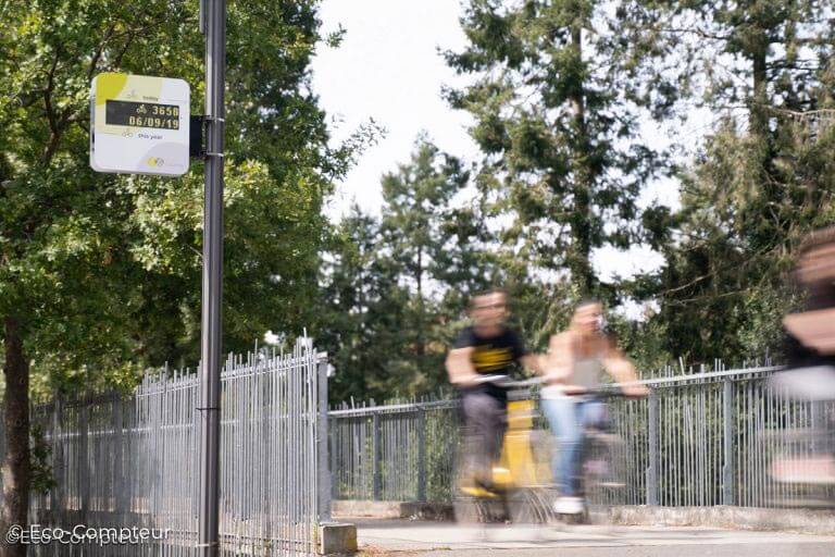
Real-time Displays
Eco-DISPLAY Classic+
Learn More
Real-time Displays
Eco-DISPLAY Light
Learn More
Real-time Displays
Eco-DISPLAY Compact
Learn More
Onboarding Emails
<!doctype html>
|
Contact Us!

Search
Do you have a specific need? Use our search engine! 

