Using data to improve pedestrian & cyclist safety for Vision Zero

Vision Zero is an international traffic safety project that aims to eliminate all traffic fatalities and serious injuries by improving roadway networks. The Safe System approach is a framework that rethinks transportation safety to anticipate human error and mitigate harm when these mistakes occur.

The most vulnerable road users include pedestrians, cyclists, and e-scooters. Active transportation safety data is crucial make the right decisions to improve cyclist and pedestrian safety.

Bike fallen in front of a car

The safety data most cities are missing 

According to data from the National Highway Traffic Safety Administration, almost 9000 pedestrians, bicyclists, and other non-motorists were killed in motor vehicle crashes in the US in 2022. This was a 56.5 percent jump in fatalities compared to 2013.

Factors challenging bicycle and pedestrian safety include:
    • Absence of suitable infrastructure (e.g. Bike lanes)

    • Conflicts of use between multiple user types (E.g. Cars, bikes, e-scooters)

    • Lack of visibility or speed regulation on roads

With reliable data on non-motorized road users, you can learn where improvements are needed and how safety has improved over time. These two insights are foundational for building a safer city.

Woman riding on a street in between two cars

Key safety indicators for Vision Zero

Speed graph

Speed

How fast are bikes going? Will there be conflicts of use on certain paths?

Mode share graph

Mode Share

Is there a sufficient amount of space for each user type?

Near miss graphic

Near Misses

Where on my network do potential accidents occur most frequently?

Hotspots graphic

Hotspots

Do I have intersections where the volume of users is very high?

How do I make cycling and walking safer in my city?

Measure long-term trends

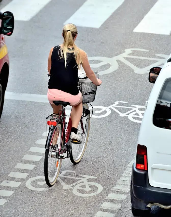
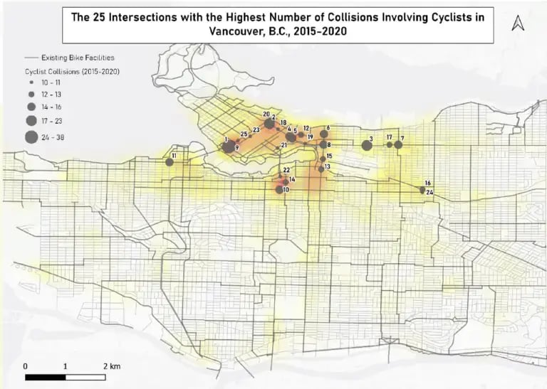
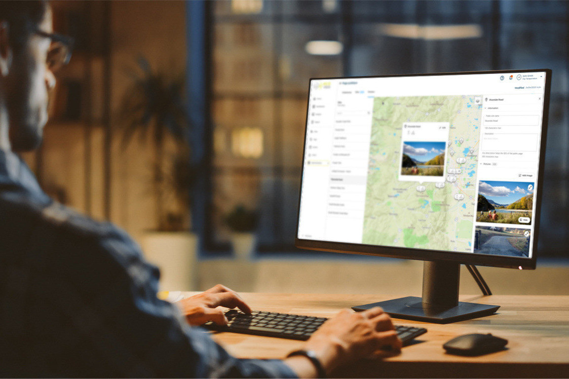
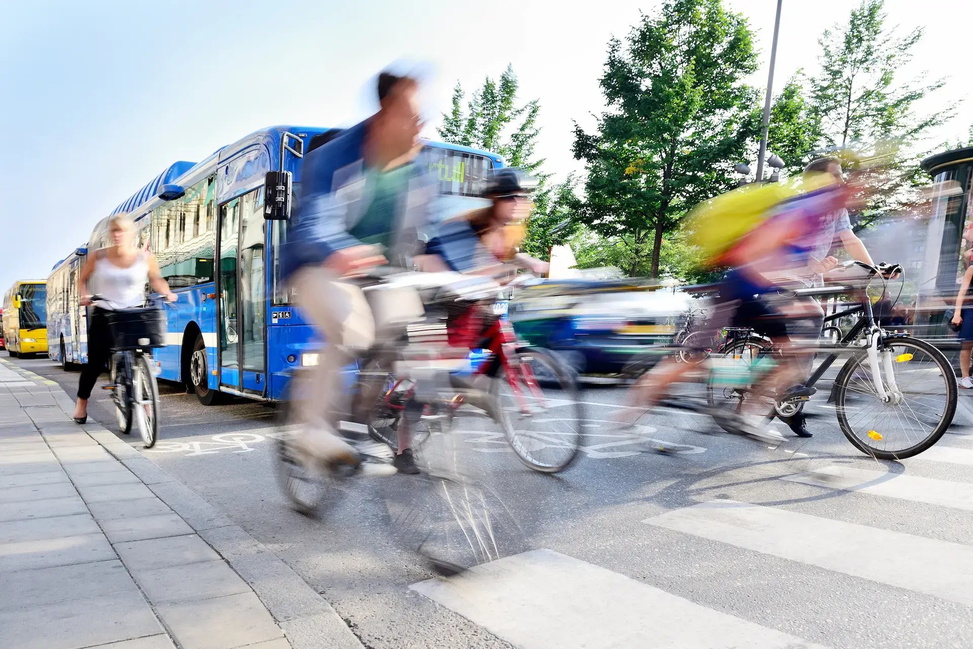
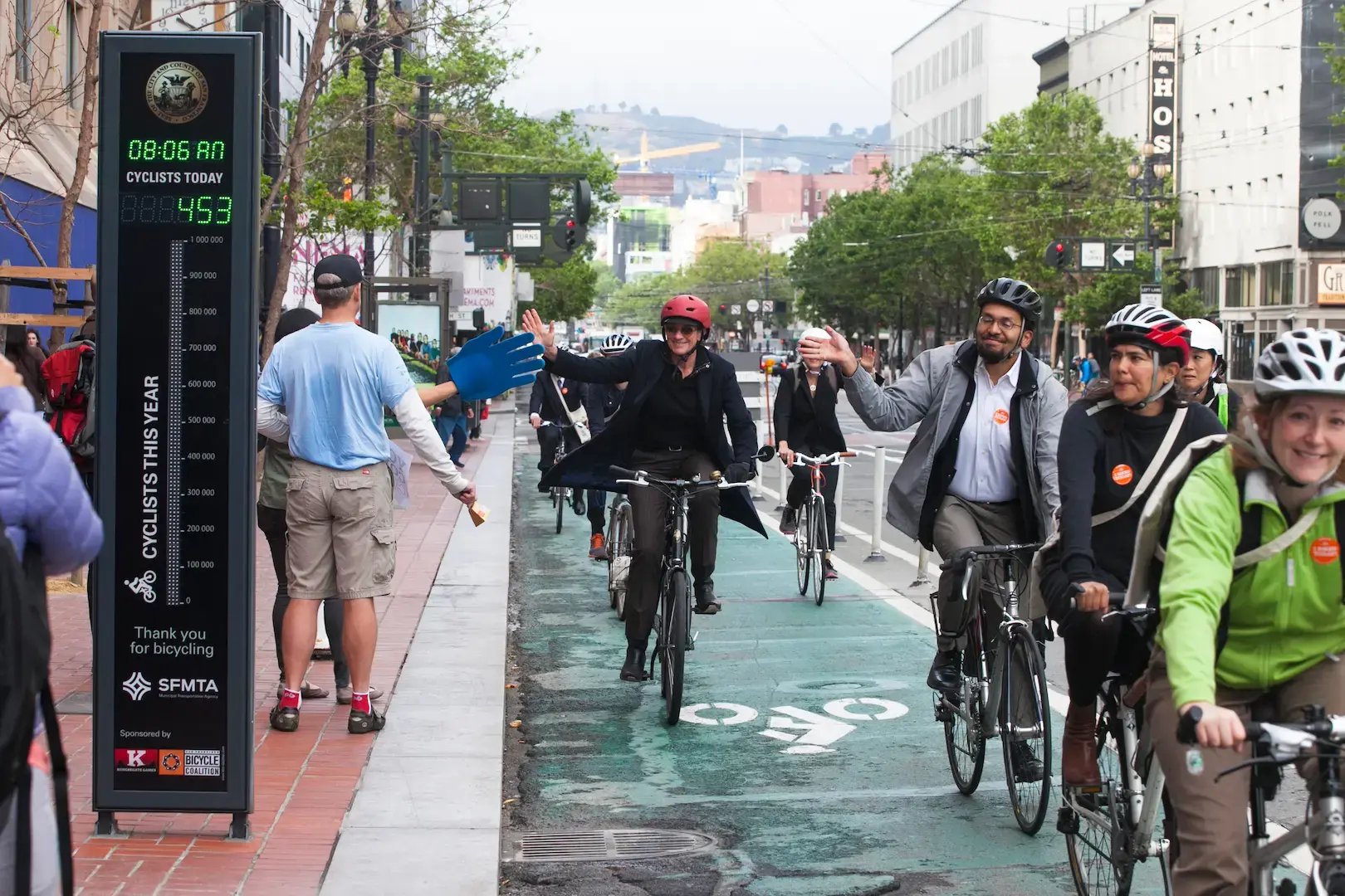
To enhance bicycle and pedestrian safety, the first step is to capture traffic volumes on a reliable, consistent basis. This way, you can observe how traffic evolves, month after month and year after year.

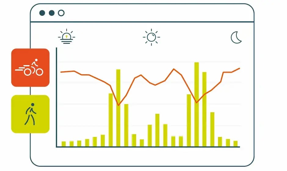
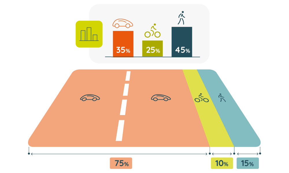
From there, you can learn important information about your network. For example, are some facilities more popular than others? If so, which ones? Are more people walking and cycling than expected? How fast are these practices growing? This "big picture" of your traffic numbers lets you compare with other key figures like total collisions to improve overall safety in a strategic, data-justified way.

Trends graphic

Gain deeper knowledge of your network

Data knowledge graphic

A solid database can give you greater insights about your network. For example, counting active transportation users can tell you which roads are busiest. But, if you look a little deeper, you can identify routes where traffic is lower than expected, a sign that a facility is perceived as unsafe.

Additionally, you can cross-reference count data and GPS data with tools like Cycling Insights. These solutions provide valuable figures such as sudden braking rates, a clear indicator of danger levels at an intersection.

Study key intersections at the ground level

At key intersections, using a counting solution means that you can be confident your data represents the ground truth (in other words, what's truly happening). With tools like the CITIX-AI Evo camera-based solution, you can collect easily interpretable, granular data over a large area on multiple user types at once.

From there, you can look at elements like trajectories, speeds, and conflicts of use to measure real-time safety. You can even measure exposure to risk with AI features like counting "near-misses."

Counter and pedestrian graphic

Case study: Vancouver

In 2021, we conducted a road safety study for the City of Vancouver, Canada using an innovative method of cross-referencing data sources. The main question they wanted answered: Was their city a safe city for cyclists?

To answer this question, Accident and bicycle count data from 2010 to 2020 were cross-referenced to identify periods and locations of greater risk in their network.

The study revealed that the risk of collision was highest in late autumn and early winter, with dangerous intersections on major arterial roads without protected bike lanes. The data also showed that the most dangerous locations in absolute terms (total # of accidents recorded) were very different from the most dangerous locations by ratio (# of accidents recorded/frequency of use). The most accident-prone intersections were found on the city's outskirts.

Vancouver cyclist collision graph

How Eco-Counter can help

eco_alouest_BD

Expertise

At every stage of your project (choosing count sites, selecting counting solutions, using analysis tools, etc.), our teams are here to help.

CAMS_INSTALL-2

Support

Already have a project in mind? Contact us and our dedicated support team will help you get it started from square one.

PWP_VUE_CARTO-3-1

Tools

Reliable hardware, user-friendly software, and guaranteed data quality: we provide a complete solution with products and services to get you the best possible data.

FAQ

What is Vision Zero?

Vision Zero is a safety strategy that aims to eliminate traffic deaths and serious injuries. It focuses on designing streets and transportation systems that reduce risk for everyone, especially pedestrians and cyclists.

For local governments, Vision Zero means moving from reactive safety planning to proactive, data-driven decisions.

Why is pedestrian and cyclist data important for Vision Zero?

Crash data shows where people were hurt, whereas count data shows where people are exposed to risk.

Pedestrian and cyclist counts help agencies understand:

  • how many people are using a corridor,

  • when and where exposure is highest, and

  • how safety conditions change over time.

This context is critical for Vision Zero planning.

What types of indicators support Vision Zero safety decisions?

Most agencies start with indicators such as:

  • daily and hourly pedestrian and cyclist volumes,

  • peak usage periods near intersections,

  • speed data,

  • mode share data,

  • before-and-after counts following safety projects.

These indicators are easy to interpret and powerful for decision-making.

With this data, try to answer these key questions:

    • Which facilities are people using most?

    • What times are people using your facilities?

    • What are the different user types for each facility?

    • How fast are users going, and where are the high-risk areas?

Can pedestrian and cyclist data support funding applications?

Yes. Many funding programs expect data beyond crash history.

Count data helps:

  • demonstrate need and demand,

  • show exposure to risk,

  • document outcomes after implementation.

In your applications, it allows you to:

  • identify high-exposure corridors,

  • compare locations using consistent metrics,

  • show you have a solid plan backed by clear, defensible data.

Going further

Explore related topics and discover how data can be used in each situation:

AdobeStock_71531619

Modal share
& space allocation

How wide? Which direction? How much should it curve? Building pedestrian and bike facilities is no easy task and requires reliable data to make the right decisions.

HD_ECO_DISPLAY_CLASSIC_COM_USA_SFMTA_Purchase from Myleen Hollero

Communication

Communication with the public is a key part of active transportation development. Maximize the impact of communication campaigns using physical tools (roadside displays) and digital tools (data-sharing webpages) to show off your data.

AdobeStock_1086208897

Weather Impacts

The effects of the weather (rain, snow, heat, wind) on active modes are indisputable but often misunderstood. Analyze how weather causes behavior changes and make the right decisions about infrastructure maintenance.