.webp?width=205&height=50&name=LOGO_EN_LARGE%20(1).webp)
Introduction
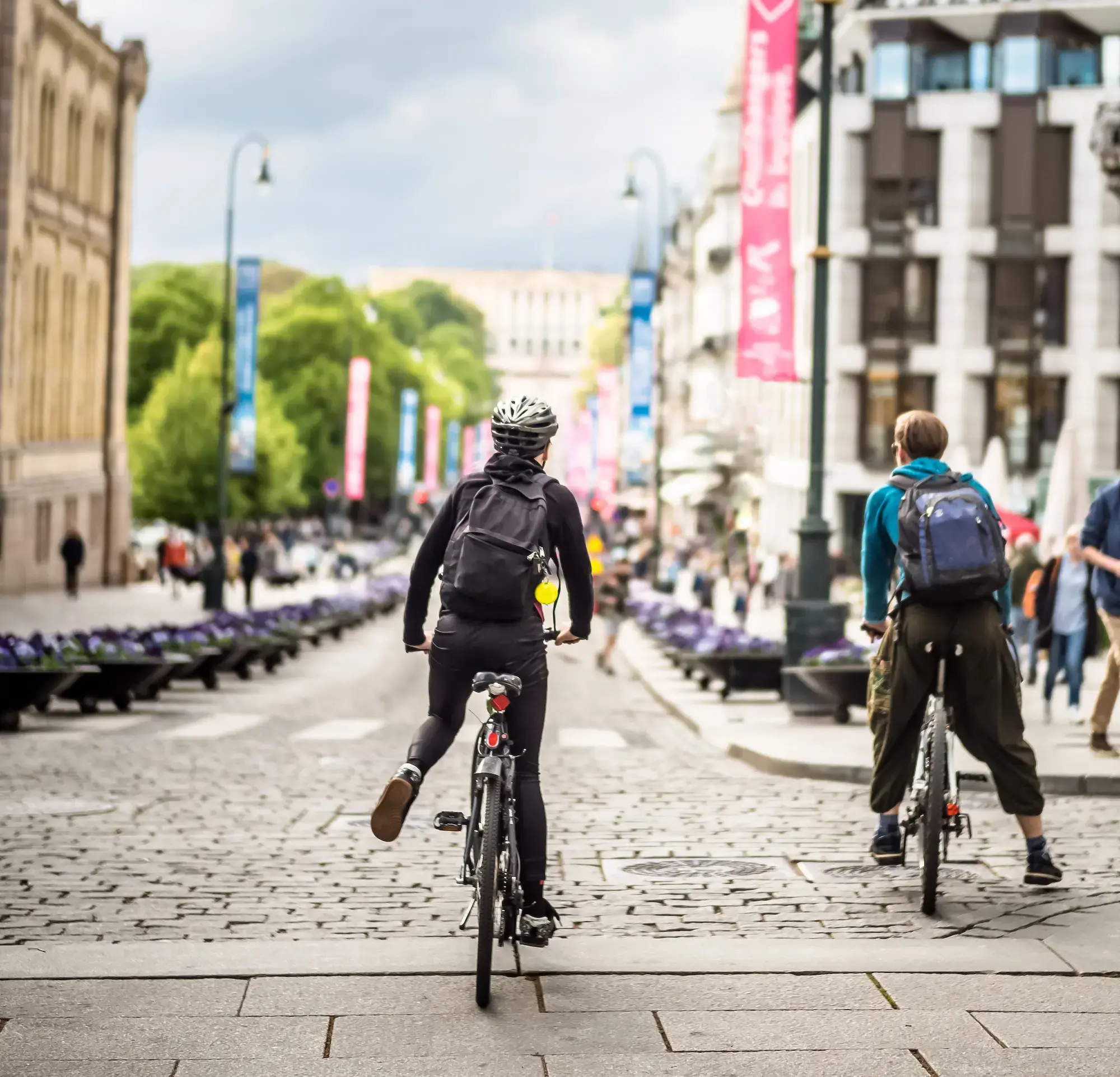
When Oslo's Green party led administration set an ambitious cycling target, a 25% share of trips compared with the 4 to 5% measured at the time, the city needed a way to track progress between travel surveys that only run every four years. Continuous bicycle count data, first installed in 2014, became the tool that let Oslo follow its sustainable and active transportation planning year by year instead of once every four years.
We spoke with Ellinor Ragnhild Anderson, Data Analyst for the City of Oslo's Insights team, part of the Department of Mobility Development. The team is working on green transport planning. We discussed to understand their data challenges and how they turned continuous data into evidence to support bicycle development.
Challenge
In 2014, cycling infrastructure planning in Oslo largely followed a fixed infrastructure plan rather than actual usage data ("infrastructure-driven" rather than "data-driven"). The first counters came in through a research angle: the Institute of Transport Economics wanted to compare cycling conditions on state-owned roads with city owned infrastructure, and especially how different levels of winter road maintenance affected cycling.
At the same time, the city's new cycling target set up a political goal that needed to be tracked. Travel surveys, run every four years, could not show whether the target was being met from one year to the next, or which investments were actually moving the needle. The Insights team expanded its counter network to close that gap.

Solutions
Oslo placed its bicycle counters strategically, at the main access points into the city center, so the network would capture citywide trends rather than isolated streets. Growing from the first installation in 2014 to 31 monitored locations today, the network shows how a counting system can scale gradually as new monitoring needs come up.
The team also uses temporary counters to run before and after comparisons. Placed near locations where new cycling infrastructure was built, they let the Insights team compare the effect of high-quality infrastructure against more modest changes made at other sites.
The City of Oslo is publishing bicycle count data, along side other transport alternatives in its "climate sykkeltrafikkbarometer", part of an ongoing data sharing effort to share the results of its initiatives with the general public.
Outcomes
Key insights
Continuous count data follows the same broad trend as the modal share measured in Oslo's travel surveys, with an 82% increase in bicycle traffic between 2014 and 2025. Cycling traffic reached a record high during the COVID years, a record that stood for several years until it was broken again in 2025.
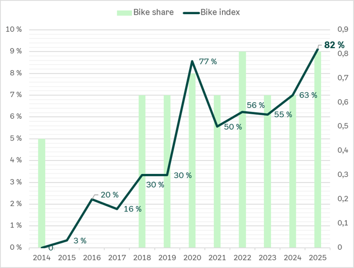
Another insight is that the largest year-on-year increases now happen in winter. The Insights team's data analysis links this to improved winter maintenance and to the growing use of e-bikes, which make winter cycling more manageable.
Where high-quality cycling infrastructure was built, the before and after counters showed a higher traffic increase than at locations with more modest changes, a direct, site-level way to compare investments and justify projects.
Comparing against neighboring cities without the same infrastructure investment also helped the team untangle the reasons behind the increase in bicycle traffic. It showed clearly that the rise in usage was linked to infrastructure improvements, and less to broader trends such as more favorable weather or growing e-bike use, since comparable cities that did not make the same infrastructure changes saw more modest increases.
Impact
The winter cycling research that started with the first counters in 2014 fed into a broader push for better winter maintenance on the city's cycling network, and proved that better maintenance led to higher winter ridership.
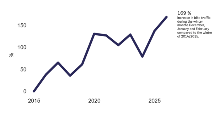 Graph showing the evolution of bicycle traffic
in the winter in Oslo between 2015 and 2025
In one recent infrastructure project, traffic did not increase as expected right after high-quality infrastructure was built. The count data let the team look further and trace the gap to a road closure further down the route, which had diverted a significant share of bicycle traffic. Once the road reopened, the figures showed the expected increase.
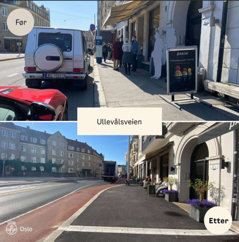 Example of a before / after bicycle infrastructure redesign project in Oslo
The same kind of evidence, bicycle counter figures showing how many people were actually using new infrastructure, has also supported one of Oslo's more debated projects: removing a significant amount of car parking. This kind of data-driven decision is what let the Insights team justify the project internally.
Learnings
Beyond any single project, the team values having continuous data on hand, useful for many different questions as they come up. As Ellinor puts it, "it's the equivalent of having climate data vs weather," longer trends tell the full story.
Oslo's experience points to a few lessons other cities and regions could reuse. A permanent counting network and temporary before and after counters serve two different, complementary purposes: the permanent network tracks long-term, citywide trends, while temporary counters isolate the effect of a specific piece of infrastructure.
Conclusion
Continuous, strategically placed count data let Oslo's Insights team follow a political cycling target between travel surveys, defend specific infrastructure investments with figures rather than assumptions, and build a stronger case for the winter maintenance work that keeps people cycling year round.